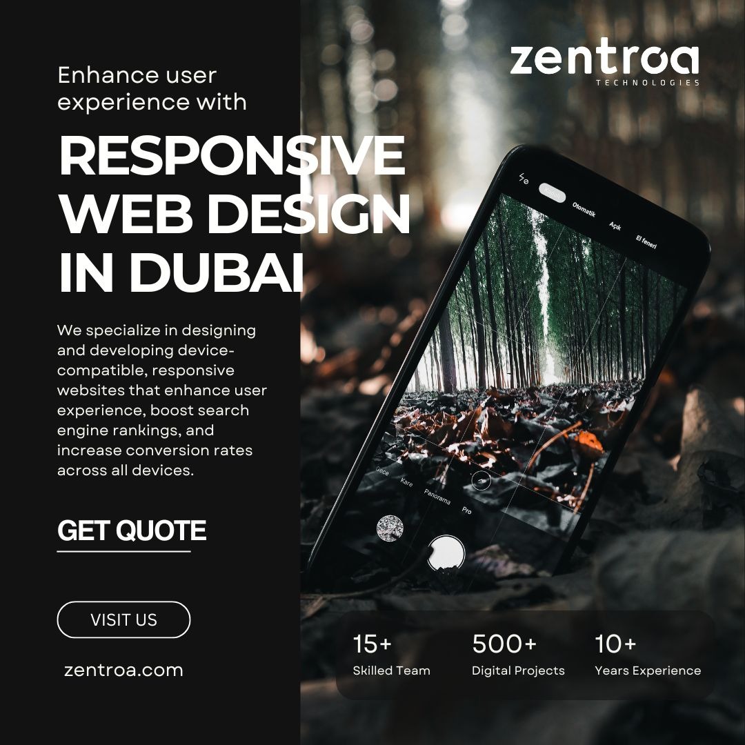
At Zentroa, we specialize in designing and developing device-compatible, responsive websites in Dubai that enhance user experience and ensure your business stands out online. Our expert team creates websites optimized for all devices, boosting search engine rankings and driving higher conversion rates. A responsive design means your website looks and performs flawlessly on a smartphone, tablet, or desktop. Elevate your digital presence and stay ahead of the competition with cutting-edge, user-focused web design. Choose Zentroa for a seamless, engaging online experience that captivates visitors and maximizes your business potential. Transform your website with Zentroa today!
10 Key Reasons Why Responsive Web Design is a Must for Your Website
Better User Experience: No matter what device you’re using (phone, tablet, or desktop), the site will look and work well. This makes browsing easier and more enjoyable for visitors.
Mobile Traffic Growth: More people use mobile devices than desktops today. A responsive website ensures you don’t miss out on these users.
Cost-Effective: Instead of creating separate websites for mobile and desktop, a responsive design works across all devices, saving money on development and maintenance.
Improved SEO (Search Engine Optimization): Google loves responsive websites because they provide a better user experience. This can help your site rank higher in search results.
Faster Load Times: A responsive site can be optimized to load faster across devices, which is crucial since people often leave sites that take too long to load.
Easier Maintenance: With a single responsive site, you only need to update one version instead of managing multiple versions for different devices.
Increased Conversion Rates: A website that works well on any device is more likely to convert visitors into customers because it’s easy to use.
Future-Proofing: As new devices with different screen sizes continue to come out, a responsive website will automatically adjust to them.
Better Analytics: With one site, tracking user behavior is easier because you don’t have to track multiple websites or apps for mobile vs. desktop.
Consistency: A responsive site ensures your brand looks and feels the same on all devices, creating a consistent and professional image.
So, in short, responsive design helps your website reach and satisfy users on any device, improving both their experience and your business results!